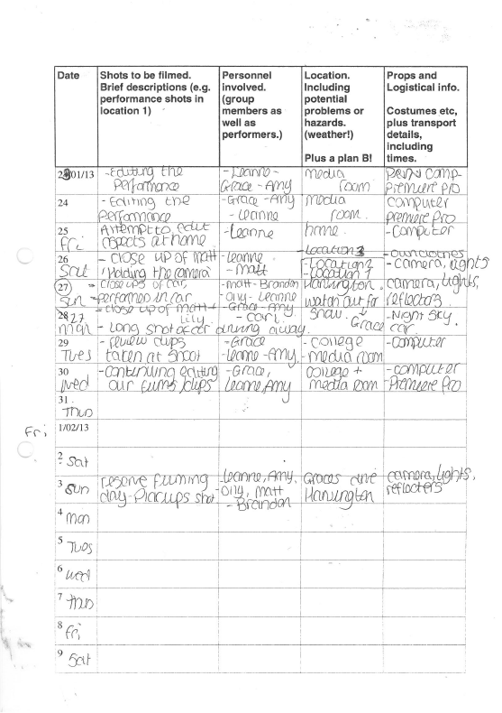
Sunday 23 December 2012
Plan
Thursday 20 December 2012

Possible Locations


Tuesday 18 December 2012
My life for the next few months..
I have created a timeline on timetoast of the key dates me and my group have set for this years coursework.
Anamatic Storyboard
I have created a digital storyboard of the first 30 seconds using drawings and put to the song. This gives a brief idea of the types of shots and narrative we want to use in our video.
I have repeated the shots frequently just as an idea of what is going to happen and the full shot list is more detailed into the what the shots are of.
I have repeated the shots frequently just as an idea of what is going to happen and the full shot list is more detailed into the what the shots are of.
The drawings show a basic outline of the shot types and who will feature, but these are subject to change at any time.
mash up
we created a mash up of ideas using the videos we have looked at for inspiration
This a mash up off different music videos including the shots we intend to use in our music video in the first 30 seconds.
Music videos used :-
1. Justin Bieber - Beauty and a Beat
2. All Time Low - Time Bomb
3.Cardigans- My Favourite Game
4. Fall Out Boy- I don't care
5. Green Day - Boulevard of broken dreams
Thursday 13 December 2012
Our little talks
We had a group meeting today,
We have decided to start filming next friday, and have sent an email to our cast asking if they are available and making sure they have broken up from school...

We have also looked at a list given by our teacher about what to include in our planning. We have gone though and given each of us a small list of tasks to do for the groups planning.
Wednesday 12 December 2012
Driving our creativity
We intend on using several close ups of our chosen car. This video shows well the types of shots we are aiming to achieve, such as the close up of the radio, and the extreme close up of the bonnet, which gives a distinct feel about the age of the car and the age in which the video is set.
Tuesday 11 December 2012
Costumes
Costume
|
Source
|
Potential cost
|
Person in charge
|
Notes
|
Bands clothing`
|
Their own clothes
|
N/A
|
All of us
|
Give them the ok on what clothes they do choose to wear.
|
Driver costume
|
Leanne and driver
|
N/A
|
Leanne
|
Ask neighbour if he is ok to dress up.
|
Girls clothes
|
Her own clothes
|
N/A
|
Grace
|
Give them the ok on what clothes they do choose to wear. Make sure
there is time to get her ready.
|
Jewellery
|
grace
|
N/A
|
Grace
|
For use with Lily
|
Earpiece
|
Unknown at the moment
|
N/A
|
Amy
|
For the driver
|
Sunglasses
|
House
|
N/A
|
All of us
|
The table shows a brief outline of the types of costumes we may need.
The boys clothes, are typical- t-shirt, jeans and shoes which they will provide themselves. We have decided not to provide it all for them, as they already look like the audience who would listen to this music, we thought it may be easier if they looked 'normal' and dress how they would normally.

Props
This is a list of props which will be needed in the making of our video. it represents aspects of the narrative and performance, which we intend on carrying out.
Prop
|
Source
|
Potential Cost
|
Person in charge
|
Notes
|
Guitars and Bass
|
Matts own
Brandon’s own
Olly’s own
|
N/A
|
Leanne
|
Will need suitable transportation.- I.e Leannes car and be able to fit all 3
inside.
|
Drum kit
|
Ben’s own
|
N/A
|
Grace
|
Need help carrying it and moving outside.
|
Car
|
Leanne’s neighbour
|
Petrol costs.
|
Leanne
|
Let neighbour know when we plan to film.
|
CD player / Kindle (mp3 format)
|
Leanne
|
N/A
|
Leanne
|
Ensure they are charged. Spare batteries?
|
Guitar amps
|
Matt and Brandon
|
N/A
|
Leanne
|
Electricity supply, unless we use portable ones- something to look
into
|
Comb
|
Leanne
|
N/A
|
Leanne
|
|
Bed
|
Bens house/Grace
|
N/A
|
Grace
|
|
Make-up
|
Grace
|
N/A
|
Grace
|
|
Shopping trolley?
|
supermarket
|
Not sure
|
All of us
|
Will need to ask supermarket permission
|
Mic stand
|
Matt
|
N/A
|
Leanne
|
Electricity
|
|
Equipment needed
|
Provided by?
|
Notes
|
|
Lights
|
College or Leanne dad
|
Book out from college
|
|
Camera
|
College
|
Book out from college
|
|
Green Screen (?)
|
College
|
Book out from college
|
|
Reflective disc
|
College
|
Book out from college
|
we need to ensure that all the equipment will be available to borrow from college at the time we aim to film and shoot.
performers and casting
We have recruited a total of 5 people to feature in our music video.
We asked if they were interested before we decided fully on the song choice.
 Matt Parkinson- This is my brother, who is a singer/song writer who plays guitar in his free time. He is really keen to get involved alongside two of his friends. During the video he will be part of the band the main singer in the performance element. As he is my brother, I have easy access to ask him questions and to feed the dates of shooting too, to which he could pass on to the other members.

Brandon Dowell- Matt and family friend. He is already in a separate hobby band, and he can play the guitar. He will be party of the band , playing guitar. His look suits the genre of music, we will just have to ensure he shows his face a bit more often. I also have easy access to him to feed information to ensure he understands.

Olly Irwin- A friend of Brandon's. By adding Olly on Facebook, I am able to interact with him to feed information to him. He already plays the bass, which is a huge bonus for the performance element.

Lily Hewitt- This is Grace's sister, so she will have the main responsibility for letting her know when we are shooting and performing e.c.t. we are still yet to introduce all of the performers to each other, but it should work well. She will be playing the acting role of the main singers girlfriend and she shall appear in selected parts during the video and on a cliffhanger ending.
Ben Martyn-Smith- Ben is the boy who lives at the house whose driveway we are going to use. He will play the drums in the background as this is because his parents have restricted us on what we can use him for. Overall we will still have a whole band which will work well.
We asked if they were interested before we decided fully on the song choice.


Brandon Dowell- Matt and family friend. He is already in a separate hobby band, and he can play the guitar. He will be party of the band , playing guitar. His look suits the genre of music, we will just have to ensure he shows his face a bit more often. I also have easy access to him to feed information to ensure he understands.

Olly Irwin- A friend of Brandon's. By adding Olly on Facebook, I am able to interact with him to feed information to him. He already plays the bass, which is a huge bonus for the performance element.
Lily Hewitt- This is Grace's sister, so she will have the main responsibility for letting her know when we are shooting and performing e.c.t. we are still yet to introduce all of the performers to each other, but it should work well. She will be playing the acting role of the main singers girlfriend and she shall appear in selected parts during the video and on a cliffhanger ending.
Ben Martyn-Smith- Ben is the boy who lives at the house whose driveway we are going to use. He will play the drums in the background as this is because his parents have restricted us on what we can use him for. Overall we will still have a whole band which will work well.
Monday 10 December 2012
Lets test those shots!
after not being able to gather our models to help us test shoots, we decided to try out some shots ourselves. We arranged it on the friday, to film on Monday. Come Monday morning, it hadn't initially struck me we were filming, so I apologize.
We have tested the opening shot of the artist 'holding the camera' The first shows then holding it themselves, and the second showing evidence of them holding out their arms as if they were holding it.
this first test was with myself holding the camera about me literally. as you can you, it clearly shows my face and my moth lip-syncing to the song, and a bonus was i could see myself when recording. However, it was very hard to keep the camera still so it looks a bit shaken. Giving a camera to a 15 year old and making him hold the camera and perform will prove very difficult and I doubt he will be able to keep it still. Although Just Bieber looked like he was holding it, his filming looked a lot more still than how we tried it with actually holding it.
This second shoot shows me reaching out to the camera, which was on a tri-pod to gain the effect of myself holding it, much like Justin Bieber. We felt this was the best way to film this part as again you can clearly see the lip-syncing and it does look like I am holing the camera. also there is also the second view of the director who can see what the recording looks like and can alter the camera accordingly.
We then tested several ways of entering the car. We also used different shots to achieve this, such as a close up of the feet and a mid-shot.
This first one shows myself jumping over the side of the car into the back. This was a safety precaution we had to look into and tripping over may be dangerous. As the video slightly shows at the end, I whacked my knee on the body, so this is something we are going to have to look into when we look at our risk assessment. This entry was good as we could easily change it to slow motion and slow it down to make it more interesting, and is a more interesting way of entering the car.
This was filmed from a mid-shot, of a slight jump into the back of the car, but this time through the door. this was not as interesting as the jumping, but we had to look into all the possibilities into entering the car in case there were any moves my neighbor did not want preformed into his car.
This third shot is a close up of the feet stepping into the car naturally.
using a mixture of these shots, perhaps one way for each band member will back the narrative more interesting to the audience and the different ways of entering the car, rather than just stepping in.
Thursday 6 December 2012
Target audience update
I have created a Powerpoint to help define my target audience a little bit further, we aim to try and reach a wider audience perhaps (shown through my blogger poll questions) of people who may not necessarily listen to this genre as a preference.
Inspiration of looking in the mirror and green day
we have looked at 'Green day- Boulevard of broken dreams' and taken note of the close up shots of the car which are really interesting to look at, and we are considering to use some in the video.
We have also had another idea of the band members looknig at themselves in the car mirror before they enter the car. The issues with this is that we will have to make sure you cannot see the camera when filming.
This video has a few examples of elements we may try to achieve- even though this is out of our music range.
Digipak Feedbak


There were mixed views on my digipak. Anthony did not understand why there were two dark shadows behind the singer on one of the slides. After telling him that these were shadows of the other two band members, he started to understand what was being shown across. This shows elements of aberrant reading and he did not understand what I was trying to achieve with certain aspects of my digipak.
Having said this, he did really like the overall idea which shows further evidence of negotiated reading. He liked the idea as a whole, but looking at certain panels, he found elements he did not agree with. Mark is similar having a negotiated reading pattern. He liked how I had used elements in both my digipak and advert which shows and instant audience recognition between the two. His only criticism was about the shadows, although he only went into a little more detail when I asked which shadows. Emily shows a different approach, and as a female shows different views, perhaps telling me something about my gender target audience, He view is preferred reading, commenting that she liked what I have done to achieve my outcome.
Poster feedback


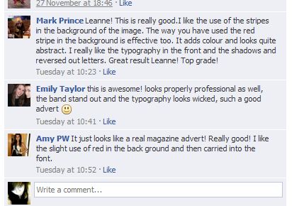
The overall feedback was very positive. They liked how the shadows behind the models made it look realistic and how the text was built up wit the colours.
Mark Prince really liked my poster, suggesting that it meets the target audience I am aiming at. It also builds up the 'teenage' atmosphere and the way I have designed the poster reflects on this mood. He has taken and approach to preferred reading and agrees with all of the elements I have designed. The red stripe has been commented as effective and adds more colour to my final piece, which is one aim I hoped to achieve.
Emily's comment about it being professional helped me to understand that I have achieved the best result I could and I am now determined to do a really good shoot for the video. She too is a preferred reader as she really liked the elements like mark and understands everything I am trying to show through.
The final comment was from Amy and again her view was very preferred. She also commented on the red stripe which added more colour to my poster and reflected the colours of Brandon's jumper, contrasting well and spreading throughout the page. She knew what my aim was and it seemed to work really well as your eyes are drifted throughout the whole poster and not just little sections.
discarded images from digipak
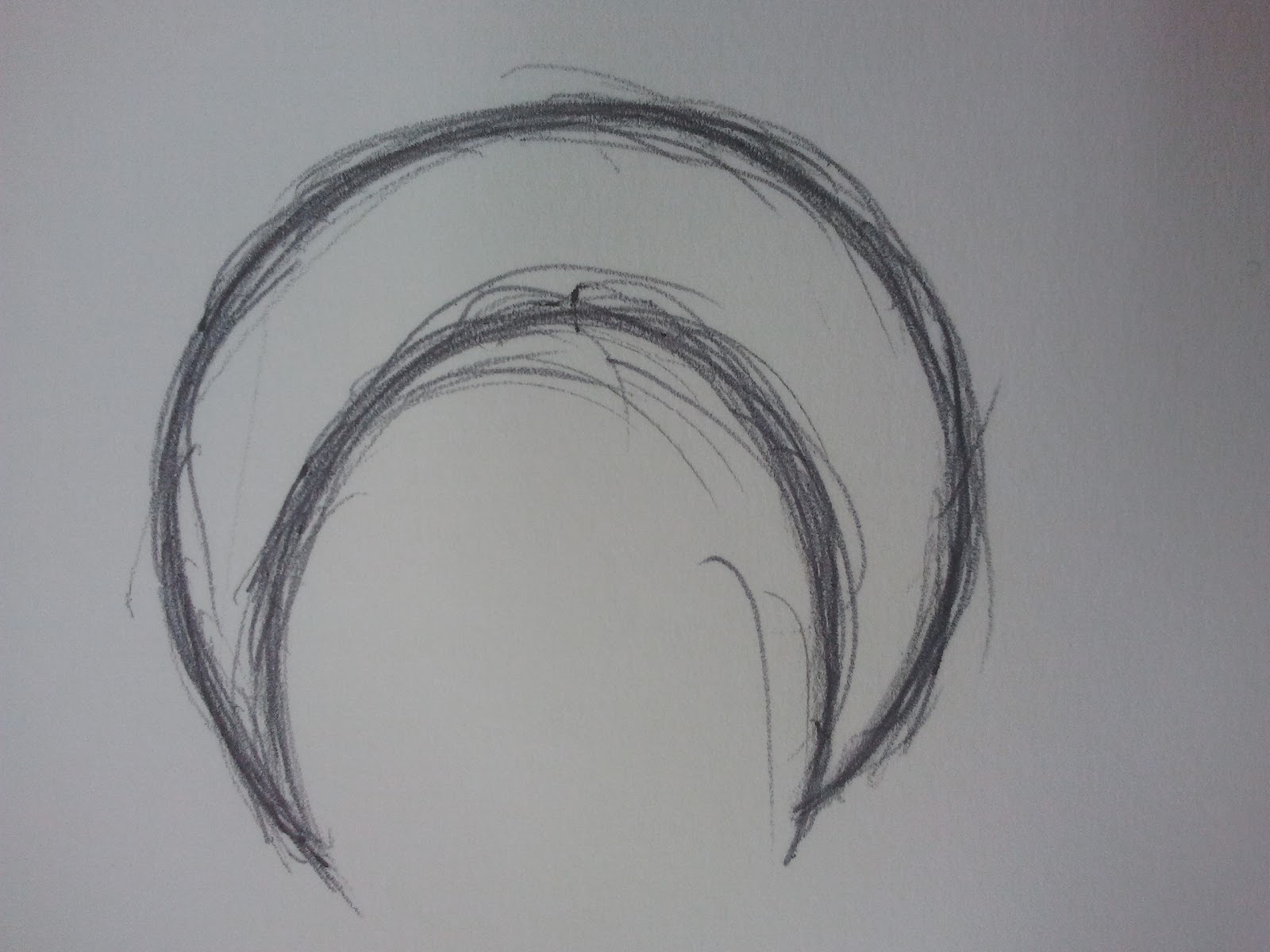 This was a sketch of a moon I drew intentionally for my digipak. It did not turn out quite the way I wanted it too , so I created my moon on the computer instead. It was very hard to remove the grey background and the sketch outline in order to produce a professional looking moon. I think if I created a solid line, which was not sketched, it might of worked better.
Dates for Trial Shots
6/12/12
My group and I have confirmed a date and time of which we will be taking some test shots of the models 'jumping ' into the car.
 we hope to achieve a good result of ellipsis of the car, which we will then develop in our real music video.
We will also betesting out the handheld shot we plan to use at the start and also close up shots of the car.
however it turns out that two of our cast members have educational purposes which we we acknowledged and therefore have decided to complete the test shoots ourself.
My group and I have confirmed a date and time of which we will be taking some test shots of the models 'jumping ' into the car.

We will also betesting out the handheld shot we plan to use at the start and also close up shots of the car.
however it turns out that two of our cast members have educational purposes which we we acknowledged and therefore have decided to complete the test shoots ourself.
Tuesday 4 December 2012
Bieber to rein the start!
we looked at the video 'beauty and the beat' by Justin Bieber, and we really liked the idea of the artist holding the camera himself, (or looking like he is)
we plan on using this interesting shot at the beginning of the video, when the artist says 'Whats up guys' before it goes into the main song. We thought it was a really good idea and will add a good effect as it leads into the main video body.
we plan on using this interesting shot at the beginning of the video, when the artist says 'Whats up guys' before it goes into the main song. We thought it was a really good idea and will add a good effect as it leads into the main video body.
Friday 30 November 2012


Magazine Advert techniques
 To create the background I formed a black block colour and used an effect so it faded out towards the opposite corner. I then used the eraser tool in photoshop to erase much of the background to white, leaving the shapes on the page creating a unique backdrop.
Creating the red stripe was fairly easy and adds more colour which nicely contrasts with the guitarist jumper and the text shadows. I opened a new document on drew a straight line on the page. I then used the 'deform' effect to make allow it to curl round, as shown. I then used the brush tool and the opacity to draw a line down the thin line created. I then inserted it onto the poster behind everything else by dragging it down layers.
 'Perfection' was very simple to achieve, which I feel looks very effective. I wrote the first 'Perfection' in black and then duplicated the layer twice more. Each layer, I converted to a different colour- red and white, which I then layered them together to create the three colour effect. The 'out 20th December' just used red and black, using the same technique.
The most interesting technique I used was the shadows of the guitarists. I used the brush tool on a new layer with a large, low gradient brush. I then painted round the sides of the models and then lowered the opacity to make them less visible. The layer was then moved beneath the models so it looked like a shadow behind them.
I created the drummer using the paint tool in photoshop. by using a think brush I draw the outline and then filled in with a block colour to create a sillohette.
Thursday 29 November 2012
Final advert
This is my final magazine advert for my digipak.
I created it using photoshop with different tools and effects.


Tuesday 27 November 2012
Progress of digipak
I have printed out my digipak to see how it will all work. The problems I had with it was the the left page printed pit backwards. So I will need to address this. I also do not like the back cover much as it does not look as professional as the others. I have decided to change this and see what other effects I can use to make it more suitable.


The images are upside down/.
i suggest turning the monitor upwards... this way they will be the right way up.
I haven't worked out how to rotate them yet.
The images are upside down/.
i suggest turning the monitor upwards... this way they will be the right way up.
I haven't worked out how to rotate them yet.
Wednesday 21 November 2012
Digi-pak update
I took a number of photos for my Digi-pak on monday, I am taking a few more tonight of the band member who could not make it. I am in the process of editing these in order to use them..
Focus Group
I have created a focus group on the well known site 'Facebook' and added various amounts of people. those in my target audience and also a few who may not think of this as their favourite genre to hear their input.
I will begin by inserting images on products created and ideas into the group to hear feedback from those included which will help me create a better music video and print.

I will begin by inserting images on products created and ideas into the group to hear feedback from those included which will help me create a better music video and print.

Album update

This is on of the bands actual album cover for a few of their songs- not including the one we are using. I don't particularly like it because I do not believe it represents the bands energy. It looks like they have gone for a sophisticated looking album, but for an energetic band. Furthermore it does not represent their songs in the way they are performed. Many of the bands songs are upbeat and fast, but the cover signifies slow and meaningful songs which is not generic of a song to album relationship (the album portraying imagery from songs).
CAR!
After weeks of questioning whether my group will get hold of a car for filming, we have reached a conclusion.
We have a car! and a driver!
My neighbor has agreed to drive his tradition convertible for us on three conditions:
- he knows the dates which we are filming
-he is not away
-it is dry
We have a back-up plan of contacting local dealerships and using the green screen if this does not go to plan.
I have not been able to get photos yet because it has been raining, but this shall happen soon.
Tuesday 20 November 2012
Inspiration
After visiting a convention talk with the chief examiner.. we were inspired by a fellow media group from a previous year.... they also featured a car in their video and went round car dealerships requesting to sit in their car to film.
As we are experiences a few issues with our car, we thought we may try this idea... it would mean using a green screen for the background which wasn't our intention... but we are still open to ideas
Tuesday 13 November 2012
Text
I have been looking at different typography, to use for my digipak and which I think would be the best suited for the genre and band.
 The text I have chosen is called 'The quick monkey' which is really quirky and sets off a nice vibe to the album.
I downloaded this font from dafont.com and installed it into windows, which I could then use in my work.
I also looked at the following.
-ExperiTypo5

-waste of paint

-Network Vampires

The text I have chosen is called 'The quick monkey' which is really quirky and sets off a nice vibe to the album.I downloaded this font from dafont.com and installed it into windows, which I could then use in my work.
I also looked at the following.
-ExperiTypo5

-waste of paint

-Network Vampires

I did not use any of these because I felt that they did not really fit into the genre of music I am working in. Network vampires would of been ideal if the band was more metal than upbeat rock as it shows an eroded feel which does not fit in with the band I am working in.
Text feedback
I posted my blog post of 'Text ideas' onto my Facebook wall and asked for some opinions.
I received three likes- which was pretty pointless as it didn't tell me anything, and 2 comments: shown below-

I received three likes- which was pretty pointless as it didn't tell me anything, and 2 comments: shown below-

Monday 12 November 2012
Text ideas
Hey guys, I am creating a digi-pak for a punk rock band called Late Nite Reading, a teenage group with an upbeat song, and I could really do with your help.
Comment below with the text you like the look of which would fit into the genre, muchly appreciated :)
1. 2.
3.

Comment below with the text you like the look of which would fit into the genre, muchly appreciated :)
1.
2.3.
4.
Saturday 10 November 2012
Paramore
I like this poster because although there is not a complete image of the album being advertised, the name of it covers the page. The full imagery of the title 'Riot' covering the whole poster is very mind-filling and will encourage the audience to remember the name. The single red colour title stands out amoungst the rest, furthermore connoting a audience visual relationship to the album cover.
It is very memorable and catchy which will help audience sales.
Friday 9 November 2012
Art work

Advert research- Portrait
FINK
The name of the band is in big letters, which is considerably larger than the rest of the text in the advert.
The white text contrasts well with the sea background, which I am guessing has some connection to the album theme.
The image is very central, and is really clever, showing the album within the album. I really like this idea, however I do not believe it will be suitable for my genre.
The overall effect is good with the image showing an instant recognition and the main focal point. The text is in the same font as the band name which shows the connection between the two products.
ZEBRA HEAD
- phoenix. The imagery immediately shows a connection between the advert and album name by using the fire wings.
-

- The album cover design has become the advert which I do not really like because the advert looks too busy. However it does create audience recognition of the album cover if they wish to go and buy it, they know what to buy.
- all the text is in the colour of white which stands out nicely upon the background.
-The imagery I over to the left allowing space for the text on the right which shows it is proportional.
-overall I would not really use the features from this advert in my own as although the idea is good, it is too busy and I do not like the idea of the album cover becoming the whole advert.
Advert analysis- Landscape adverts
ROME-

The simplicity of the colour scheme is very interesting and it draws your attention to it more than if it was covered in colour.
The main image is of a black heart with ink (?) dripping down at the bottom- with minimal detail. This is situated in the middle of the advert which is the main focal point.
The serif font 'Rome' is particularly interesting as it is different from the rest of the sans serif font making it unique to the artist and will relate to the album being released, which shows there will be some connection.
The rest of the text is sans serif and certain phrases such as 'Out now, Rome' in the colour red, which stands out from the rest of the advert, which contrasts and works really well with the black and white.
Dananananaykroyd

The album is split into proportional thirds, each with one or two words in. Each third has a pattern emerged into it in a light grey colour with similar patterns in a darker orange scribed into the advert background instantly showing audience recognition between the two.
The band names seem to be in capitals in all of the adverts I have looked at, perhaps to grab the attention of the audience as it will be the first thing they look at, and if they have heard of the band, they may buy the album in the shop.
Subscribe to:
Posts (Atom)